Wireframe vs mockup vs prototype: what you’re approving
A founder we worked with last year sat through three weeks of design reviews nodding politely at gray boxes. She thought the studio was showing her an unfinished product and being slow about it. What she was actually looking at was a wireframe, and her job in those meetings was to catch a structural problem that would have cost five figures to fix two months later. She caught none of them, because nobody told her that was the assignment. The checkout flow had the payment step in the wrong place. It shipped that way, and the fix landed in week nine instead of week one.
That gap is what this article is about. The wireframe vs mockup question sounds like a designer’s problem, but if you are paying a studio to build custom software and you do not write code, it is squarely yours: once the discovery phase has settled what you are building, you will be handed wireframes, then mockups, then a prototype, usually in that order, and asked to approve each one. Knowing what each is for is the difference between giving feedback that saves you a month and giving feedback that wastes everyone’s afternoon.
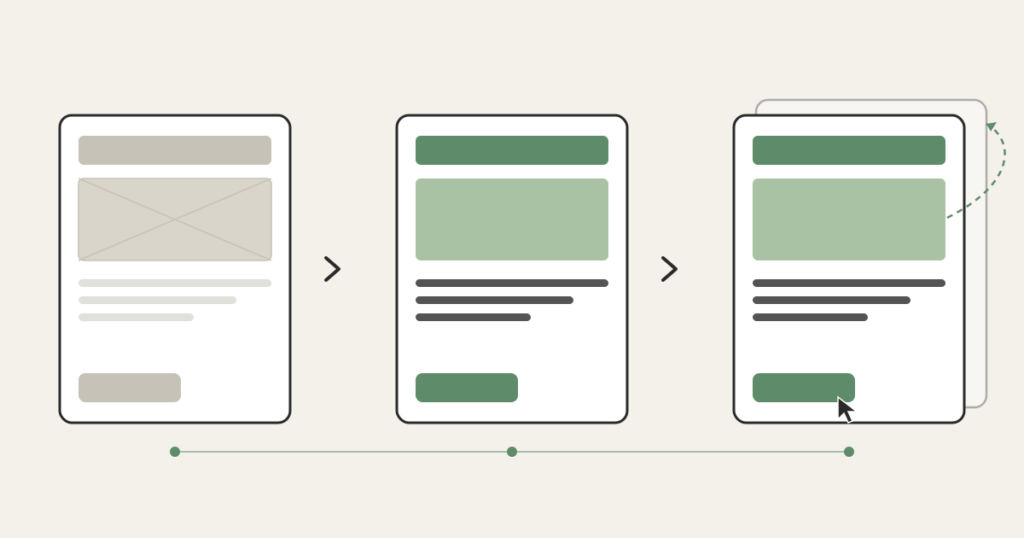
Here is the short version of wireframe vs mockup vs prototype, the three words you will hear most. A wireframe is the blueprint: gray boxes and labels showing what goes where and how the screens connect, with no color and no branding. A mockup is those same screens with the real visual design painted on: your colors, fonts, spacing, logo, the actual look. A prototype is the mockup wired together so you can click through it like a real app, even though nothing behind the buttons works yet. Wireframe answers “is the structure right?” Mockup answers “does it look like us?” Prototype answers “does the flow actually work?” Three artifacts, three questions, three different jobs for you.
Wireframe vs mockup vs prototype: why the studio shows them in that order
The order is not arbitrary, and it is not the studio being slow. It is the studio spending your money in the cheapest possible sequence.
Changing a wireframe takes minutes. Someone drags a box, relabels it, moves a button from the top of the screen to the bottom. Changing a mockup takes longer, because now there is real visual design to redo: the spacing, the color treatment, the way the component looks in three states. Changing a prototype takes longer still. And changing the actual built software, the thing running on real code, is the most expensive change of all, sometimes by an order of magnitude.
So a competent studio front-loads the decisions that are easy to reverse and pushes the expensive, hard-to-reverse work to the end. They settle structure first, when structure is free to move. They settle visual design next. They confirm the flow last, before a line of production code gets written. The whole sequence exists to find your objections while they are still cheap. It is also where the abstract scope you wrote into a requirements document the studio can quote from finally becomes something you can see and react to.
This is also why “just skip the wireframes and show me what it’ll look like” is a tempting request that usually backfires. When you jump straight to a polished mockup, you and the studio start debating the shade of blue and the rounded corners, and nobody notices that the entire navigation model is wrong. Polish hides structural problems. The gray boxes exist precisely because they have nothing pretty to distract you.
What you are actually approving at each stage
The artifacts are easy to define. The hard part, the part the design-tool blogs never cover, is what you are supposed to do when one lands in your inbox. Here is the job at each stage.
Wireframe: check the plumbing. Does every screen the user needs actually exist? Can someone get from signup to the thing they came to do without a dead end? Is the most important action on each screen the most obvious one? Are you collecting information at the right moment, or asking for a credit card before the user understands what they are buying? These are structural questions, and a wireframe is the only stage where they are cheap to answer. If something about the flow feels wrong here, say so loudly. This is the meeting that matters most and the one founders take least seriously, because it looks unfinished.
Mockup: check the identity and the hierarchy. Now there is real design, so now your visual judgment is useful. Does this look like a product your customer would trust with their money or their data? Is the thing you most want people to click visually louder than the things you don’t? Does the dense screen, the one with the table or the dashboard, still feel readable? This is where “make the primary button stand out more” is a useful note. It would have been a useless note on the wireframe, where everything is gray on purpose.
Prototype: walk through it like a confused user. Click the wrong things on purpose. Try to do the main task as if you had never seen the app. Hand it to someone who matches your actual customer and watch them get stuck without helping them. The prototype is the last cheap chance to discover that a flow which made sense in a static picture falls apart the moment a real person tries to move through it. The Nielsen Norman Group, the most-cited name in usability research, has spent decades showing that even rough prototypes catch the majority of the flow problems a real build would otherwise ship with. You do not need a perfect prototype to learn the important things. You need a clickable one and an honest tester.
The feedback mistake that costs you a month
The single most common and most expensive mistake non-technical founders make in design review is giving the wrong kind of feedback at the wrong stage. Specifically: giving cosmetic feedback on a wireframe, and structural feedback on a mockup.
When you tell a designer the wireframe’s font is ugly, you have told them nothing, because the wireframe has no real font. You have also signaled that you think your job is to react to how things look, which trains you to keep reacting to how things look right through the stages where structure is the only thing that matters. Meanwhile the navigation problem sits there unmentioned.
The reverse is just as costly. When you wait until the polished mockup to say “actually, users should be able to do this whole thing in one screen instead of three,” you have just asked for a structural change after the structure was supposed to be locked. The studio now redoes design work you already approved, and the timeline you were promised quietly slips. Every studio has lived this. It is the leading cause of a build coming in late while everyone technically did their job.
The fix is simple to state and takes discipline to follow. Match your feedback to the artifact. Plumbing on the wireframe. Identity and hierarchy on the mockup. Flow on the prototype. When you catch yourself wanting to talk about color on a gray screen, write the note down and save it for the mockup. When you catch yourself wanting to rearrange the screens on a finished mockup, stop and ask why that did not come up at the wireframe stage, because catching it now costs real money.
Is Figma a wireframe?
No, and the confusion is worth clearing up because you will hear the word “Figma” constantly. Figma is the tool most studios use to draw all three: wireframes, mockups, and clickable prototypes all live inside the same Figma file. So “we’re in Figma” tells you nothing about which stage you are looking at. Ask directly: is this a wireframe, a mockup, or a prototype? The answer tells you what feedback the studio actually needs from you right now.
The same goes for the other tools you might hear named. Balsamiq is built for low-fidelity wireframes, on purpose, with a sketchy hand-drawn look so nobody mistakes it for finished work. Sketch and Figma cover the whole range. The tool is not the point. The fidelity is the point, and fidelity is just a fancy word for how finished something looks. Low fidelity means gray boxes. High fidelity means it could pass for the real app. The reason designers reach for low fidelity early is the same reason the studio shows you wireframes first: it keeps you focused on the decision that is actually on the table.
Do you need all three?
Not always, and a good studio will tell you when you do not. The right number depends on what you are building.
If you are validating a rough idea and the screens are simple, wireframes plus a light prototype may be enough, and the visual mockup can ride along with the build. If you are building something where trust and polish are the product, a premium clinic’s patient portal, a fintech dashboard handling real money, you want all three and you want to spend real attention on the mockup, because the visual layer is doing load-bearing work. If you are extending an existing product that already has a design system, you may skip straight to mockups, because the structural and visual decisions were settled long ago and reusing them is the whole point.
What you should be suspicious of is a studio that wants to skip the wireframe entirely on a greenfield build and jump to polished screens. Sometimes that is fine for a tiny scope. Often it means the structural thinking is being skipped, and you will pay for that skip later, in the build, where changes are most expensive. The order exists to protect your budget. Compressing it is a decision, not an accident, and you are allowed to ask why.
None of this requires you to learn design. It requires you to know which question you are being asked, and to answer that question instead of the one that happens to catch your eye. Get that right and the design phase becomes what it is supposed to be: the cheapest place to be wrong before the build, where being wrong gets expensive. That is the whole reason these three artifacts exist, and the whole reason a studio walks you through them in order. The plan, then the look, then the proof it works, each one a chance to change your mind while changing it still costs almost nothing.
FAQ
What is the difference between a mockup and a wireframe?
A wireframe is the structural blueprint: gray boxes and labels showing what goes where and how screens connect, with no color or branding. A mockup is the same screens with the real visual design applied, including colors, fonts, spacing, and your logo. The wireframe settles structure; the mockup settles how it looks. Studios produce the wireframe first because structural changes are cheap there and expensive everywhere downstream.
What’s the difference between a wireframe and a prototype?
A wireframe is a static layout you read. A prototype is interactive: screens wired together so you can click through the product and experience the flow, even though the buttons do not yet do real work. The wireframe shows you the structure of one screen at a time. The prototype shows you whether moving between screens actually makes sense to a real person trying to complete a task.
Is Figma a wireframe?
No. Figma is a design tool that can produce wireframes, mockups, and clickable prototypes, all inside the same file. So hearing “it’s in Figma” does not tell you which stage you are reviewing. Ask the studio directly whether you are looking at a wireframe, a mockup, or a prototype, because each one needs a different kind of feedback from you.
What are the types of prototypes?
Prototypes are usually described by fidelity, meaning how finished they look and feel. A low-fidelity prototype clicks through gray wireframe screens to test the flow. A high-fidelity prototype clicks through the polished mockups and can pass for the real app in a demo. Some teams also build a coded prototype using real components. For most non-technical founders, the useful distinction is simply low versus high fidelity: use a low-fidelity one to test whether the flow works, and a high-fidelity one when you need a demo that looks real for an investor or a customer.